More than two centuries of Egyptian persecution and oppression had shuttered the Jewish imagination. We couldn’t imagine anything beyond the squalor and misery of our endless nightmare. To liberate our imaginations in the buildup to our redemption, Hashem instructed the Jewish slaves to tell the epic story of the Exodus to their children and grandchildren. This announcement was a revelation. Slaves do not typically raise families. Children of slaves belong to their owners and can be sold away as chattel. Furthermore, adult slaves can be ripped away from their children, sold, and relocated, never to be heard from again. To the Jewish slaves the prospect of children, let alone grandchildren, was unfathomable.
Hearing that they would one day tell their story to future generations unshackled their imaginations, freeing them from their dreary and bleak world and uncovering horizons of hope. Not only would they have grandchildren, but additionally, they were part of a story. Viewing our personal arc as part of a larger trajectory stretches our lives and deepens our experiences. Our decisions and behavior have greater magnitude when our lives are cast as chapters of a broader narrative.
Hashem opened their minds to their future and, each year, Passover unlocks our own imagination to our future. Our seder begins and ends with the same hopeful dream about the future: “Next year in Jerusalem”.
Past Generations
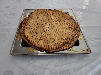
On Passover we also look backward, reenacting the dramatic exodus from Egypt by eating the exact same foods which the slaves consumed on the night of liberty. Transcending time and place we imagine overthrowing modern forms of tyranny. We don’t just look back to the Exodus, but also contemplate the great chain of Jewish history. The compelling phrase ‘“in every generation” or “b’chol dor va’dor” is repeated three times during the seder, evoking all past generations who shared our common legacy and mission.
Jews always possess multi-generational identity, but on Pesach that consciousness of past and future is amplified. Passover reaches out to our past and calls out to our future.
Comparisons
Though we celebrate continuity with our past, we also compare ourselves to past generations. We often contemplate how we stack up to previous generations, not to compete with them but to better appreciate our own historical context.
One of the foundational concepts of Jewish belief, known as the doctrine of “nitkatnu hadorot”, asserts that, as history advances, religious levels are in constant state of decline. This concept is certainly true regarding the authenticity of religious transmission. The word of Hashem was delivered at Sinai and like any other transmission, those closer to the source experience less corruption. In addition, earlier generations benefitted from both prophetic intelligence and supernatural miracles, each of which heightened the clarity of their encounter with Hashem.
For these reasons, earlier generations wield greater religious authority than later ones. As the system of halacha is inherently hierarchical, later generations defer to the rulings and wisdoms of previous generations.
Presumably, the doctrine of declining generations also applies to moral wisdom and religious piety. Thoe who lived closer to Sinai and to the source of Hashem’s word, have greater potential for piousness and for moral development. Not every individual took advantage of this potential, but many did attain lofty piety and exalted ethical behavior. Judaism has a favorable bias toward previous generations, making it averse to radical or wholesale changes which can upend past traditions.
Rejection of Modernity
This partiality to the past sometimes impairs our ability to adopt and adapt modern potential or even to embrace the notion of modernity. The modern world has made dramatic advances in almost every sector of the human condition: from healthcare, to human rights, to education, to economic and political freedom, and to general quality of life. For some religious Jews this creates an awkward dichotomy. It can be challenging to defer to previous generations while also embracing a modern world which affords a superior quality of life. If previous generations exceeded us religiously how can our modern world be superior?
This is precisely why some religious people incorrectly use the term “modern” as an antonym for “religious”. Often, a religious person will comment that another person is less religious or more “modern”. Of course, there is nothing religious or irreligious about being modern. Modern resources and capabilities can be exploited for religious growth and opportunity just as they can poison or corrupt religious experience. The general suspicion which many religious Jews harbor towards modernity reflects the powerful traditionalist tendencies of Judaism. If moral and religious standards decline, logic suggests, modernity can’t be superior.
Is everyone a midget?
Not only does the doctrine of “declining generations” foster rejection of modernity but it is also a concept which is often extended too far. Though the authenticity of religious transmission degrades, not every aspect of religious experience deteriorates. It is possible for later generations to exhibit religious qualities which previous generations were incapable of, or at least didn’t exhibit. There have been generations of uncommon faith and courage, even though their level of Torah scholarship didn’t exceed that of earlier generations.
One example are the Jews of the first and second centuries, who lived under brutal Roman oppression. Seeking to erase our religion and culture, the Romans banned numerous religious and cultural practices, prohibiting both Torah study and circumcision. Their cruelty was exemplified by viciously murdering our ten sages. Having lost sovereignty and Temple our national spirit was deflated and our religious future was imperiled. Yet, heroically this generation, known as the “dor ha’shemad” or the generation which faced the peril of religious conversion, resisted overwhelming Roman force and defied their ruthless oppression. Though their rebellion was violently crushed in 130 CE, their heroism lifted Jewish morale while also inducing a period of Roman-Jewish rapprochement. Not every generation is smaller than the previous one in every detail of religious experience. This incorrect belief can be enfeebling. In some areas we are midgets. But in other aspects we are giants.
Modern giants
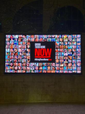
The past few generations may not be able to match the Torah study or religious piety of previous generations, but we have exhibited legendary courage, faith and tenacity. In the wake of the Holocaust, the greatest calamity to ever afflict a nation, we rebuilt our people and launched one of the most challenging projects in history. Under constant threat of war and belligerence we returned a nation to its ancient homeland. Additionally, we have faced the challenge of fashioning a durable and fair democracy, and a liberal economy, while incorporating Jews with vastly different ideologies and ethnicities into one society. This past year and the violence and antisemitism we have faced, has further demonstrated our heroism and our commitment to Hashem, land, and people. This is not a small accomplishment by a diminished generation. This is a colossal achievement by heroes of Jewish history.
Our commitment and devotion, despite the steep price, reflects our deep faith in Jewish destiny and our uncommon national courage. It also reflects our profound commitment to intergenerational consciousness. Acknowledging the stamina and survival of past generations we know that we can’t let them down. We must be strong enough to meet the expectations of past generations. We must also be strong enough to tell a story of faith and courage to future generations.
This Passover, pass through the generations of the past and of the future. Our chapter in history is not small. Neither are we.
The writer is a rabbi at Yeshivat Har Etzion/Gush, a hesder yeshiva. He has smicha and a BA in computer science from Yeshiva University, and a master’s degree in English literature from the City University of New York. He is the author of the upcoming Dark Clouds Above, Faith Below (Kodesh Press, April, 2024), which provides religious responses to the massacres of Oct. 7 and the ensuing war.